The Topopointillism of Ed Fairburn’s Cartographic Portraiture Painting
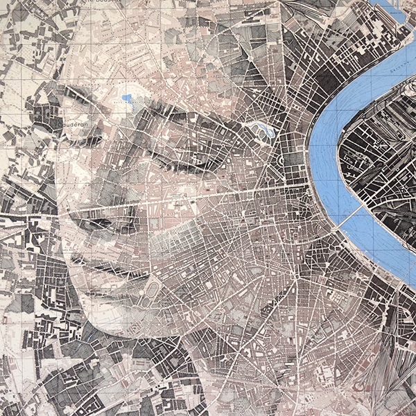
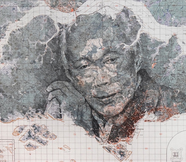
Our sense of belonging to a place stems from our relationship and emotional experience with that place. The artistry of Ed Fairburn makes this connection explicit. By tracing the contours of a map, Ed artfully merges the roads, rivers, and terrain with a person’s portrait reminding us of our affinity with our environment; who we are, and where we belong.
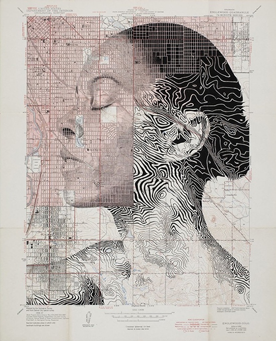
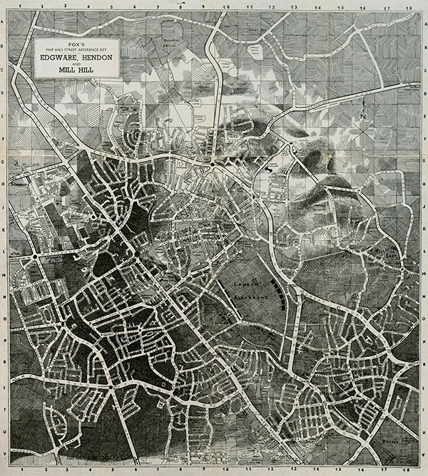
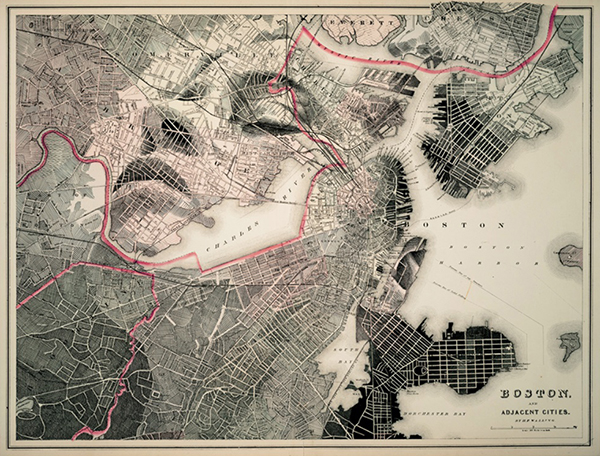
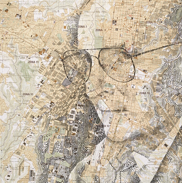
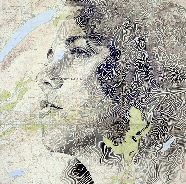
Ed employs traditional “ink and pencil” to reconstruct an original map and then transform the map by detailing a portrait on it. With a thorough study of the map and a profound grasp of character expression, Ed seamlessly uses the map to “anchor” the character’s identity. His artistry encompasses topography and pointillism (from close-up dots to 2d images at a distance) with astounding visual effects. Each face is unique, not obfuscated by the map but rather coexisting and immersive.
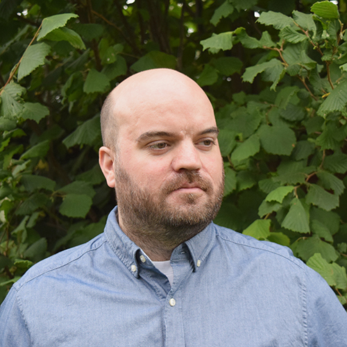
We are grateful to be able to interview Ed who has revolutionized cartography and portraiture painting. Hope the conversation below will help you learn about his extraordinary work and the definition of “topopointillism”.
Q: Your artwork is so unique; it combines two different genres into amazing presentations. Please tell us about your art training and background.
A: I came from a fairly graphic background, having studied illustration at Cardiff School of Art and Design. I chose this course because I mostly just wanted to draw. Illustration at Cardiff was a very open course at the time I was there – as students, we had a lot of freedom to explore our own interests, and really push the boundaries of what it means to illustrate. Most of the time it was just straight-up drawing, but I was also influenced a lot by friends studying fine art, a parallel course at the school. We often shared the same studio space which created a wonderful environment to study.
Q: Please tell us why and how you started to produce maps with portraitures.
A: I essentially started working with maps as a continuation of my final project at art school. Towards the end of the course, I became particularly interested in context, and exploiting various ordinary mechanisms in extraordinary ways. So for example, one of my main projects in my final year involved postal art – turning the outsides of envelopes into works of art. I had always enjoyed portraiture ever since I spent hours drawing after school as a teenager, so drawing people was (and still is) a central theme in all of my work. About six months after graduating from art school, I happened to buy an old road map from a charity shop (I’ve always collected odds and ends so this in itself wasn’t unusual); at the time I was still interested in playing around with context, and ‘hijacking’ unusual surfaces. I remember looking at the map one day wondering if I could interject my own imagery, following a set of rules. Cartography is essentially already a set of rules showing various sets of information, so when I integrated my own imagery into the map, I was essentially adding my own set of rules, thus complementing the visual language of the map. The result was a harmonious coexistence of person and landscape – both aesthetically and symbolically. Incidentally, that first map I ever bought cost me just 20p – I often think of it as the best investment I ever made. It allowed me to break into a career doing what I love. I don’t think I’ll ever stop working with maps either – the more I explore, the more I want to explore.
Q: Is there a relation between the subject of the portrait and the locale in the map? E.g., is the subject from the area depicted in the map?
A: Very often, yes, but not always. I draw real people, from real places, but the selection and pairing of a specific subject with a particular place is usually only important for commissioned work, or any self-initiated work that seeks to make a statement beyond the broad themes that I explore.
Q: What is “topopointillism”? How do you apply this technique in your artwork?
A: Topopointillism is a term I coined to describe the distance/perception relation in many of my works – particularly the works using contoured maps, where I follow lines of elevation using a sort of manual half-tone process. In short, topopointillism describes a direct combination of topography and pointillism. Like any kind of pointillism, the viewer’s perception of the subject will change according to how closely the work is viewed – up close the work is a mess of pattern, but from far away the patterns work together to form a subject. With my work, at close range, a viewer is unlikely to see a portrait, but will see the details of the map. Viewed from a distance, it’s the other way around.
Q: You have worked on many projects for major corporations and brands. Please tell us about any memorable experiences you have had from these projects.
A: I’ve enjoyed so many of the commissions from the brands I’ve worked with – it’s always exciting to receive an enquiry from a brand or agency, and learning exactly what it is they want to achieve, and why they’ve selected my work as a way to achieve that objective. I’ve travelled to all sorts of places and met lots of interesting people; I think my most memorable experience to date was working directly with MI6 (UK Secret Intelligence Service) on a creative recruitment campaign (yes, they do recruit publically – that surprised me too). They wanted to highlight the way in which their job roles are not just super technical (which is often the preconception), but critically also involve a high degree of emotional intelligence – the ability to understand “beliefs and motivations, relationships and trust” – visually, my multi-layered works fulfilled that brief.
Q: Do you prefer to use older maps for your artwork or more up-to-date maps; how do you decide?
A: I tend to use maps from a historical ‘sweet spot’ – anything too old is relatively useless, as I often work with the technical data of a map (lines of elevation for example). Maps that are hundreds of years old simply don’t contain that data. The other issue with old maps is the rarity or historical significance – as much as I love and believe in what I do, I don’t necessarily want to hijack a one-off irreplaceable piece of history! At the other end of the scale, modern maps are usually (but not always) garish in colour, and surprisingly, of a much lower quality. Mass printed maps are often produced on thinner papers using inks with a lesser longevity. Before mass printing, maps were made from engravings using natural, high pigmented inks. To cut a long explanation short, the historical sweet spot I seek is around the early to mid 20th century. Maps of a certain age are also more straightforward to work with, without encroaching on any copyright issues (although this is less of a problem than you might imagine, as lots of maps are destined for the public domain). Copyright issues are also only a potential problem where reproduction is concerned.
Q: Please take us through the process of making your art. What are the key elements you consider?
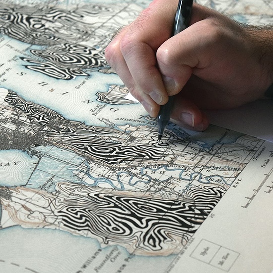
A: I spend a little while studying each landscape and subject before I begin any drawing. I search for key patterns or shapes which both elements share or at least compliment each other – I call those areas ‘anchor points’; they’re the corner pieces of a jigsaw puzzle, the keystones from which everything else is constructed. I take great care to work with the language of each map. My goal is to work with, or into, the map, not on or over it. I try to preserve the original functionality of the map as much as possible. Working with original maps, I take a ‘pens and pencils’ approach, using various archival inks, acrylics and occasionally pencil. Every map and paper type is different, so I often have to test areas before deciding which materials to use. Some of the maps in my collection aren’t even made of paper – some are fabric, some are plastic.
Q: Is there any literature or artist that has inspired you?
A: I recently wrote about inspiration, what it is, where it comes from. I’m inspired by lots of different things, but particularly in the last year or so I’ve been heavily influenced by a noir/neo-noir cinematic aesthetic. Looking at my work with maps, this influence is not immediately obvious, but I believe that most of the time inspiration is really just a feeling, a particular motivation or studio vibe which encourages or enables productivity. I’m frequently asked where or what my inspirations are, and I think my often vague response (which usually has no obvious link to maps or cartography) makes very little sense to those who ask the question – but that is what inspiration means to me – it is fleeting, often intangible and always ever-changing. When I last spoke about noir aesthetic, I cited a number of artists, a mix of photographers, painters and musicians – they included photographers Nicolas Miller, Audrey Marquis, Louis Dazy, painter Nicholas Moegly, and noir jazz musicians Bohren and Der Club of Gore, in particular their album Sunset Mission.
Q: Do you have any future projects you would like to share with our readers?
A: Nothing to share at the moment, but I am working on projects (one exciting project in particular) that have nothing to do with maps. I’m looking forward to finishing and releasing some new work hopefully within the next year.
